Ascent Basecamp
The software a mentoring organization runs on. Mentors, students, chapter leaders, and staff sign in at the same front door and get four different systems — on the web, and now in an iPhone app running on the same four roles.
Client
Ascent Mentors
Scope
Product Design & Build
Type
Web Portal & iPhone App
Status
Portal live · app in testing

Holly started it in 2020, one student at a time.
Ascent is a mentoring ministry for high schoolers — one mentor, one student, meeting week after week. Holly founded it and ran it that way for four years. Preston caught the vision of what it could become nationwide, and he and the chapter leaders were the ones who felt what it cost to run by hand.
By 2025 there were three chapters. In 2026 there are at least twelve.
Three chapters was the breaking point.
A chapter is the mentors and students around a set of high schools, run by a few chapter leaders. Onboarding one mentor meant a Typeform, a background check, abuse-awareness training, two in-house courses, and somebody chasing each of them personally — spread across Typeform, MinistrySafe, Google Sheets and a lot of individual messages.
Nothing joined up. No single database, no way to see where a mentor had stalled, no way to run communications, no read on how a chapter was doing. It held at one chapter. At three it stopped holding — and the plan was twelve.
And almost everyone using it is a volunteer: no training day, no IT desk. A screen they can't figure out is a screen they stop using.
Design for the person who didn't choose this software.
Every decision came back to one test — can a busy volunteer do the thing they logged in to do without asking anybody for help? I was a mentor in the program before I built any of this, so the test wasn’t hypothetical.
- No password to forget. Google sign-in, an email link, or a texted code. The most common support ticket in volunteer software, removed entirely.
- Role-aware from the first screen. A mentor sees their students. A chapter leader sees their chapter. Staff see everything. Same URL, four different systems.
- One obvious next action. Each dashboard opens on what's actually due, rather than a menu of everything the software can theoretically do.
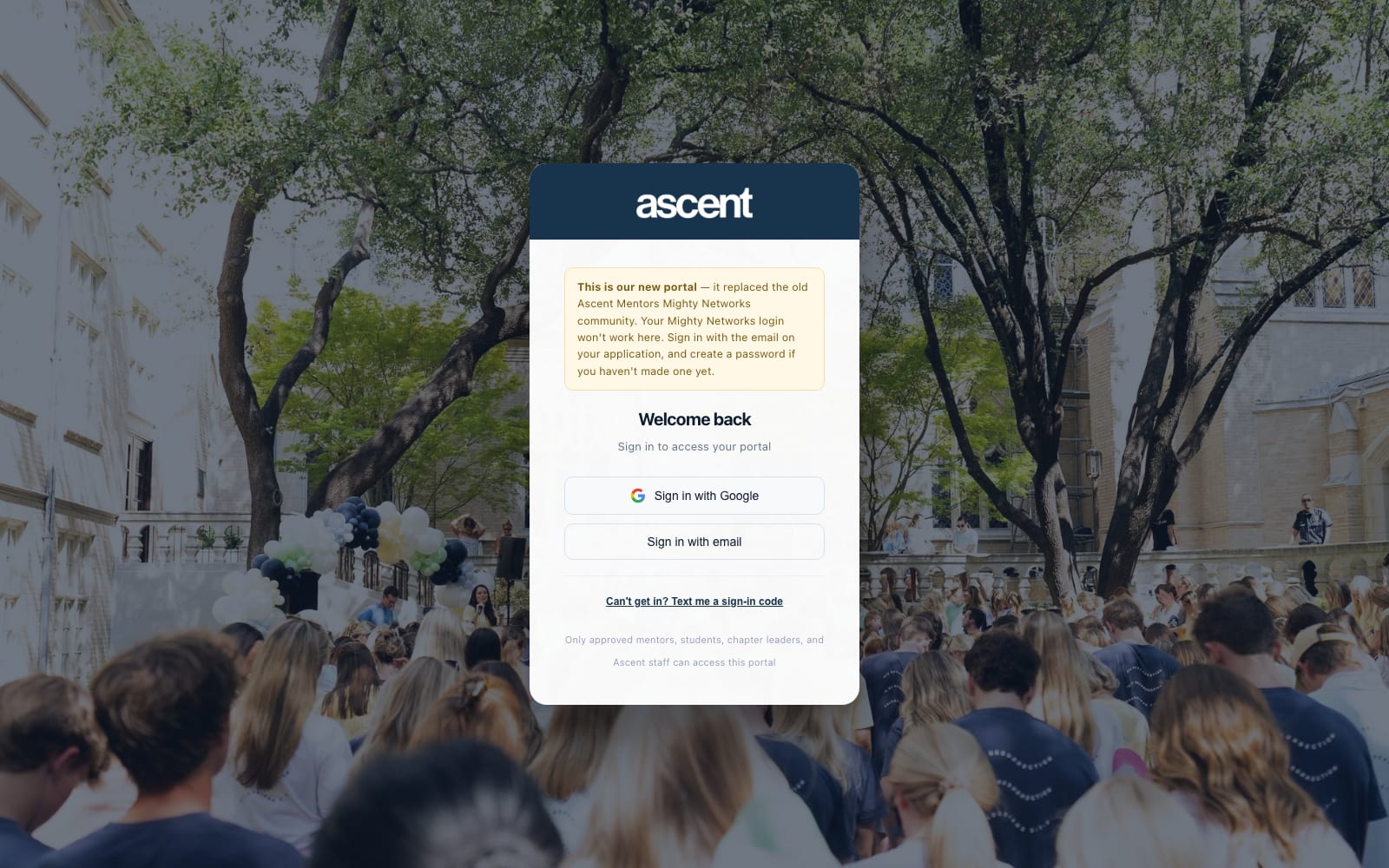
- Access is a closed door. Only approved accounts get in, and the sign-in screen says so — the portal holds records about students.
Features by role.
Four people sign in at the same address and get four different tools. This is what each of them can actually do once they're through the door.
Mentors
The volunteer. Gets a checklist, a student, and nothing else competing for attention.
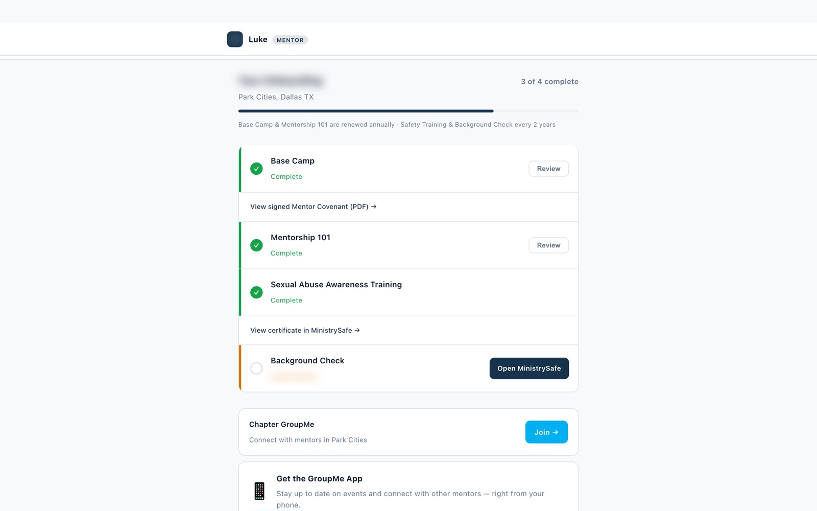
- An onboarding checklist that names the one step still outstanding and links straight to it
- Training courses with a built-in player — the coursework happens in the portal, not in an emailed PDF
- Their student, the next meeting, and a weekly check-in logged in seconds
- The chapter group chat, one tap from the dashboard
- Re-enrollment for the next season without filling the application out again
Students
The lightest surface in the system, built to be read on a phone between classes.
- Who their mentor is, and when they're meeting next
- A countdown to match day rather than a date buried in an email
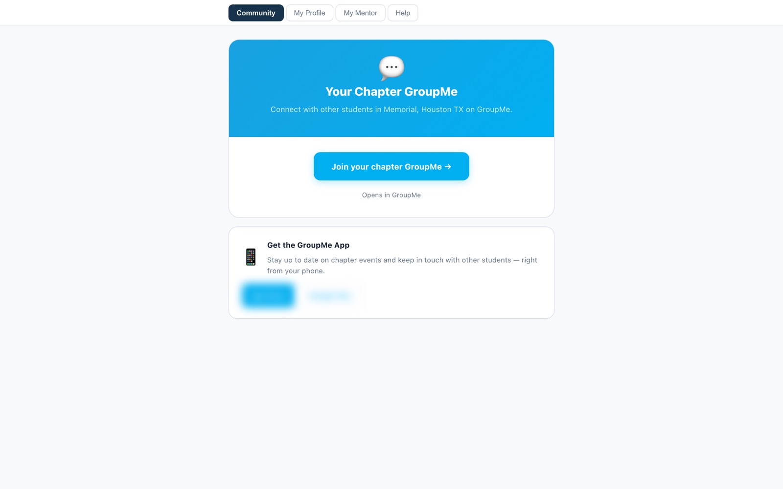
- The chapter group chat, and a Help tab with a real person to contact
- A profile they keep current themselves, instead of a staff member retyping it
Chapter Leaders
Runs one chapter. Sees their people and only their people.
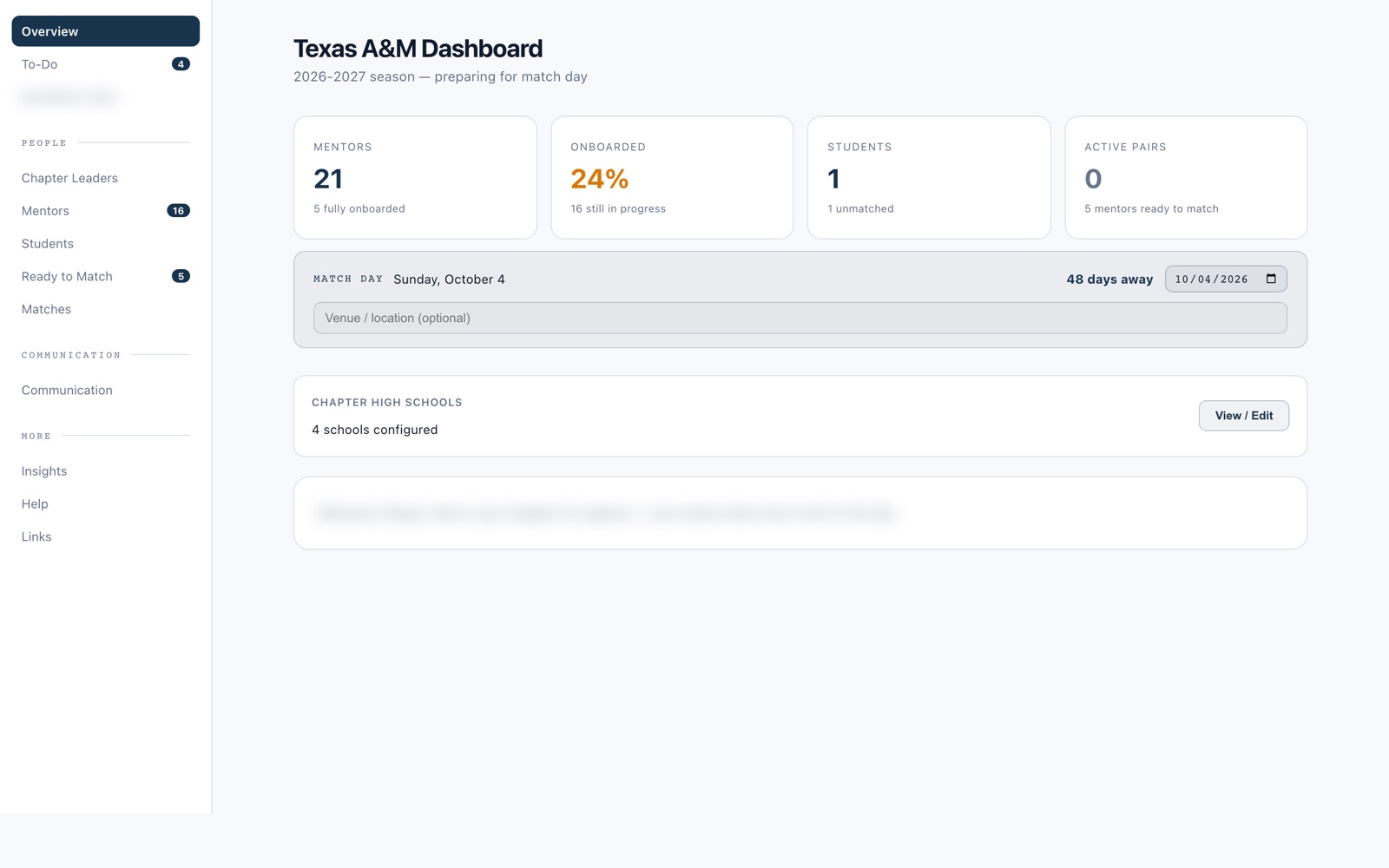
- Roster health at a glance — who's matched, who's stalled mid-onboarding, which pairings have gone quiet
- Text, GroupMe and email to their own chapter, scoped so “everyone” means their chapter
- Match day run from the portal: pairings assembled, checked, and tracked to the day itself
- Background-check and training status per mentor, without asking staff for it
Staff & Admin
Runs the organization. The deepest surface, and the one that replaced the spreadsheets.
- Communication over text, GroupMe and email — all sent from inside the site, to a chosen audience, with the history kept automatically
- Onboarding managed end to end, with reminder texts that go out on their own instead of somebody remembering to chase people
- Courses built and edited in the browser for mentors to work through — new material ships without a developer
- New chapters stood up inside the website: create it, add its leaders, and it's running
- A ticketing system, so a feature request from any chapter reaches the developer as a tracked item rather than a lost text
- Cross-chapter rosters, exports, background-check tracking and usage reporting
What each role actually sees.
A chapter leader and a student share a login screen and almost nothing else. This is the difference, side by side.
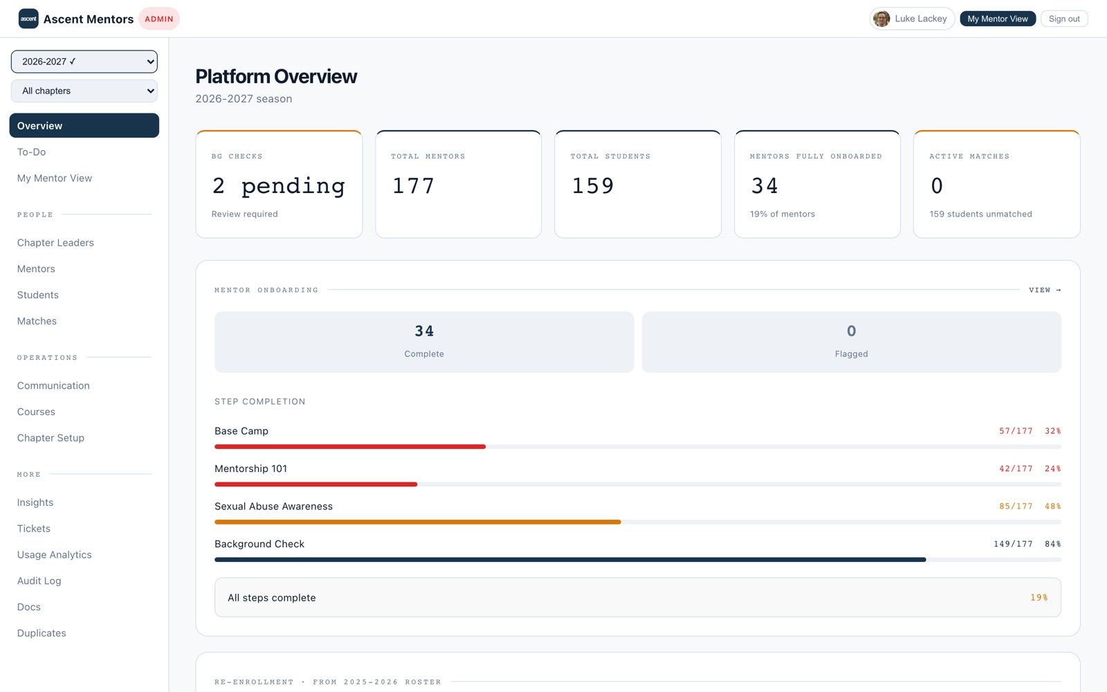
This is not a contact form with a login.
People hear "portal" and picture a members area. Here is who is actually signed in, and what is running behind the screens.
it so far
across the USA
wired in
inside the site
242 mentors, 154 students, 49 chapter leaders and 6 admins — the roles overlap, because a chapter leader usually mentors too. Behind them: Clearstream, GroupMe, MinistrySafe, Fillout, Google Drive, Google Sheets, Stripe, Resend, Anthropic and ChatGPT, all talking to one system. As of 24 August 2026
From portal to pocket.
The portal proved what the organization needed. The moments that matter happen away from a desk — so the same four roles were rebuilt as a real iPhone app, installed from the App Store and living on a home screen. Not the website shrunk into a phone-sized window.
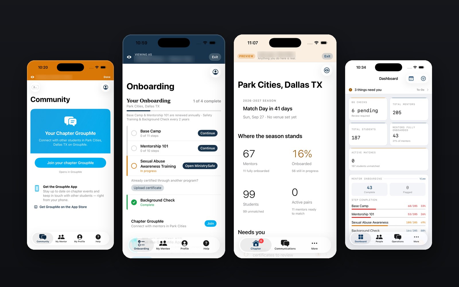
The phone is where the work happens.
A mentor logs a meeting in a parking lot. A leader checks a roster in the five minutes before a session starts. Nobody is opening a laptop for either one.
An app does what a browser tab can't. It sits on the home screen instead of behind a bookmark nobody saved. It can tap someone on the shoulder the day a check-in is due. And uploading a document is a camera button, not a file picker three menus deep.
One app that has to feel like four.
- Everyone lands somewhere different. A mentor opens on what's left to finish. An admin opens on what needs a decision. Nobody arrives in a menu built for somebody else.
- Every button says who it reaches. "Send to all mentors" is one chapter for a leader and the whole organization for an admin. The screen spells out which before the message goes anywhere.
- The weekly jobs are on the first screen. Log a meeting, read a roster, send a message, finish the next onboarding step. Everything else lives a level down, where it belongs.
- Nothing lives only on the phone. A check-in logged in a parking lot is on the leader's dashboard before they refresh it — same accounts, same records, same permissions as the portal.
What's in the build.
Every screen below is the real app, reading the same records as the portal.
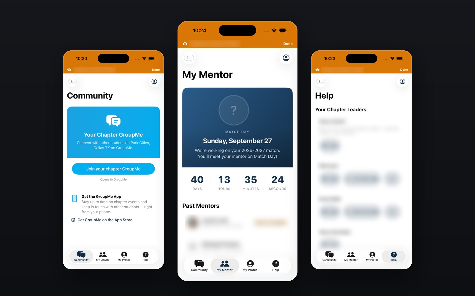
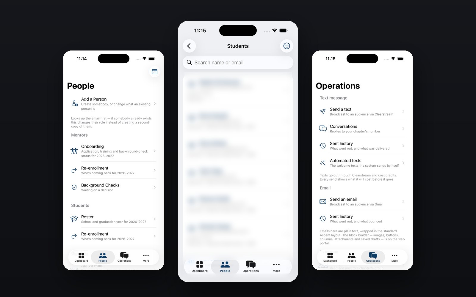
Features by role.
Each role opens the app on a different screen, because each one came to do a different job.
Mentors
Opens on what's left to finish.
- The onboarding checklist, with the outstanding step first and the button to clear it right there
- Training courses played in the app — start on a phone, pick it up on the portal
- Log a meeting the moment it ends, while it's still fresh
- A reminder on the lock screen the day a check-in is due
- The chapter group chat, without hunting for the invite link
Students
Opens on their chapter.
- Who their mentor is, and a countdown to match day on the screen rather than buried in a menu
- The chapter group chat, one tap in
- A Help tab that lists their chapter leaders with a call or text button beside each
- Their own profile, editable from the phone they already have
Chapter Leaders
Opens on their chapter's week.
- A dashboard counting down to match day, with pairings and roster health under it
- Mentor and student rosters, and who is stalled mid-onboarding
- Text, GroupMe and email to their chapter — and the screen names the audience before it sends
- Background-check and training status per mentor, checkable before a session starts
Staff & Admin
Opens on what needs a decision.
- Season totals for all eleven chapters, on one screen
- Add a person, and carry onboarding, re-enrollment and background-check status from the phone
- Text and email broadcasts to any audience, from anywhere
- Any chapter's roster, opened without asking somebody to send a spreadsheet
The portal is live. The app is in testing.
426 people run their week on Basecamp today, across 11 chapters. The app puts the same four roles in a pocket, and it is with testers now.