Ascent Basecamp for iOS
Taking a four-role operating portal native. Not a wrapper around the website — a SwiftUI app where a student, a mentor, a chapter leader, and an administrator each get an interface built for what they actually do on a phone.
Client
Ascent Mentors
Scope
Design & Build
Platform
Native iOS — SwiftUI
Status
Integrated — in testing
The web portal proved the need. The phone is where the work happens.
Basecamp on the web works, and people use it. But the actual moments that matter happen away from a desk — a mentor logging a meeting in a parking lot, a chapter leader checking a roster before a session starts, an admin approving something between meetings.
A responsive website handles that adequately. Native handles it well: push notifications that arrive when a check-in is due, camera access without a file picker, and screens that stay usable when the signal drops.
One app that has to feel like four.
A student and an administrator share a sign-in screen and almost nothing after it. What each one needs first has no overlap at all.
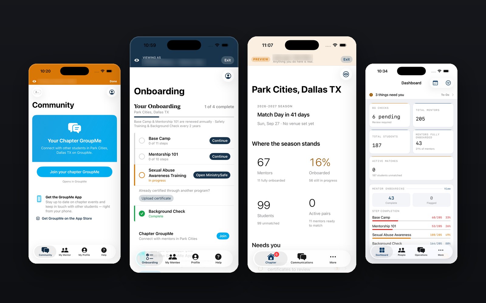
- Everyone lands somewhere different. A mentor opens on what's left to finish. An admin opens on what needs a decision. Nobody arrives in a menu built for somebody else.
- The words change with who's reading. "All mentors" means one chapter to a leader and the whole organization to an admin — so the screen says which. Wording that's right for one role and wrong for another is how accidents happen.
- The weekly four come first. Check in, log a meeting, read the roster, answer a message. Everything else is a level down.
- Decided on paper first. Every role's screens were written out before anything was drawn, so building was execution rather than guesswork.
What's in the build.
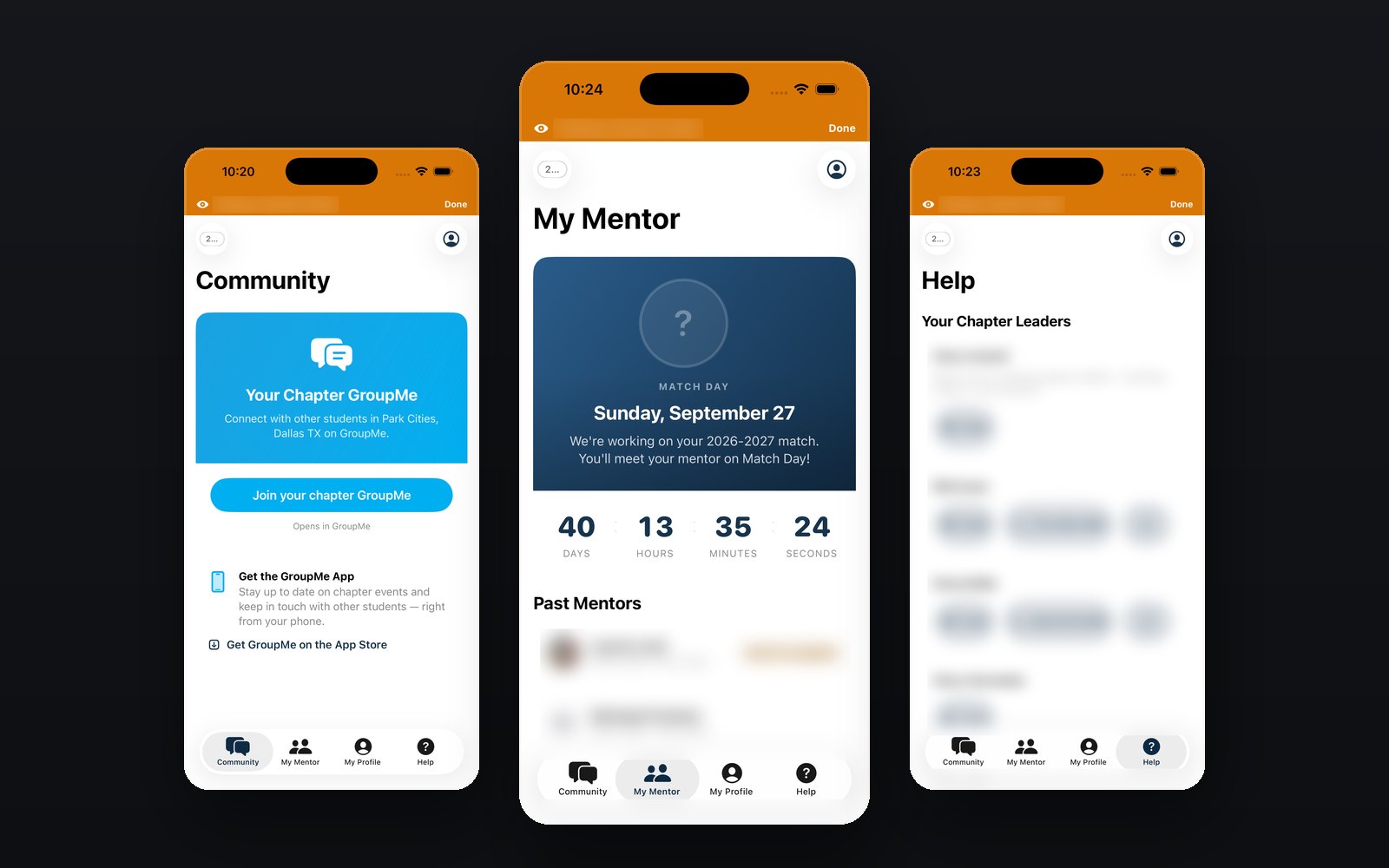
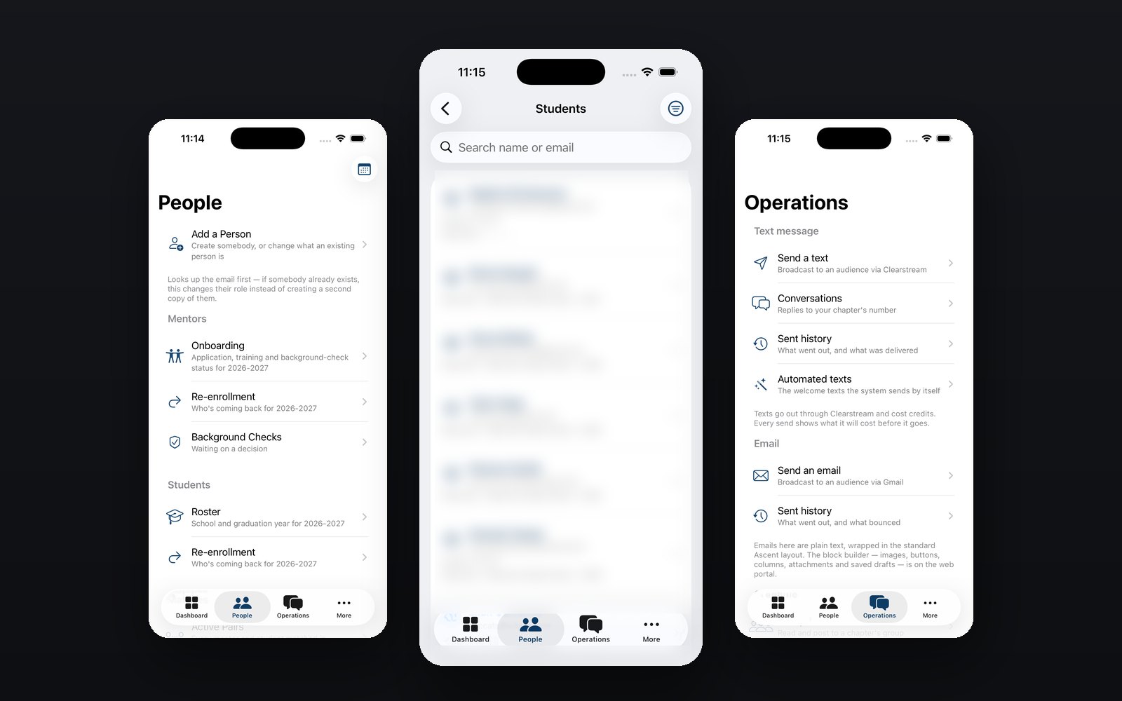
Every screen below is the real app. Names, emails and photos are obscured — the system holds records about minors. Everything else is exactly as it runs.
in one app
designed
wrapped website
signal drops
Student
Their mentor, what's next, and course content they can work through. The lightest surface in the app, by design.
Mentor
Check-ins, their students, an inbox, and the course player. The two-tap version of the weekly routine.
Chapter Leader
Matching, chapter check-ins, messaging and mail, content, and insights for the chapter they run.
Admin
The deepest surface — rosters, match day, queues, tickets, broadcasts, exports, usage, and an audit log.
Notifications
Reminders that arrive when something is actually due, rather than a weekly email nobody opens.
Shared Design System
One set of components across all four roles, so the app reads as one product rather than four bolted together.
Four roles became one app.
Each role was built as its own track. Bringing them together surfaced the real problem: the same button didn't mean the same thing to everybody. "Send to all mentors" reached the whole organization for an admin and one chapter for a leader — same screen, very different consequences.
So every one of those got a decision instead of a shortcut: the wording has to be true for whoever is reading it. Picking one and moving on is how a chapter leader accidentally messages 205 people.
It's the least glamorous phase of a build and the one that decides whether the product holds together. It's done, and the app is in testing.
In-progress work is still work.
A portfolio full of finished projects hides the part clients care most about — how somebody handles a build that's genuinely hard. This one is on the site while it's live so you can see the reasoning, not just the result.